
Lucky me - I just received a copy of The Photography of Modernist Cuisine - the art-book sibling of last year's Modernist Cuisine at Home and the previous year's Modernist Cuisine. It's impressive in every way, especially its cover - 14" x 18" and featuring the top of a tomato, blown up to something like 50 times life-size. It's a striking image, and it made me think about the purpose of cover art, in cookbooks.
The very earliest dust jackets were plain, and merely served to protect the outer surface of a bound book. But today's book covers and jackets are considered essential advertising space, and therefore answer almost exclusively to the publisher's marketing department. (When I was an editor, many of my authors were surprised to learn how little say they had in their jacket design.) It makes sense, when you think about it.
 But cookbooks are an interesting
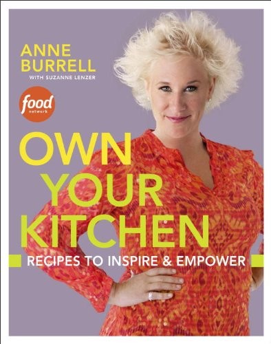
case. As I see it, there are basically 3 kinds of cookbook
covers: finished food, raw
ingredients, and what I'll call "character
covers" (though there's probably a technical name for them
I just don't know). A "character cover" gets used most often
when the book is a tie-in - to a TV chef, say, or a restaurant.
If you're buying this kind of book, the primary reason is its
connection with the person or place featured on the cover.
That's why you will never see a Paula Deen, Rachael Ray or
Nigella Lawson book that doesn't have its author on the
cover.
But cookbooks are an interesting
case. As I see it, there are basically 3 kinds of cookbook
covers: finished food, raw
ingredients, and what I'll call "character
covers" (though there's probably a technical name for them
I just don't know). A "character cover" gets used most often
when the book is a tie-in - to a TV chef, say, or a restaurant.
If you're buying this kind of book, the primary reason is its
connection with the person or place featured on the cover.
That's why you will never see a Paula Deen, Rachael Ray or
Nigella Lawson book that doesn't have its author on the
cover.
Raw ingredients on a cover, I think, serve a different purpose. Like the tomato on the cover above, they turn the reader's attention back on herself. Yes, I *am* the kind of person who enjoys fresh asparagus! I *am* the sort of person who enjoys cooking from scratch! You can almost feel yourself getting started at your cutting board. In this case, what you see reinforces your own sense of identity, making you feel good about purchasing a book that is, at some level, "like" you.
 And as for finished dishes,
these are the bread-and-butter (if you'll pardon the expression) of
the industry. If your mouth starts to water when you look at
the cover, then you're more than halfway to a sale, right? I
have a theory they're particularly popular and successful among
baking books, just because baked goods are almost always photogenic
- as opposed to say, a fabulous-tasting but slightly brown and
dumpy-looking boeuf bourgignon. (Of course, not even the most
beautiful photography can guarantee you'll cook from a given book,
as all of our sagging shelves attest.)
And as for finished dishes,
these are the bread-and-butter (if you'll pardon the expression) of
the industry. If your mouth starts to water when you look at
the cover, then you're more than halfway to a sale, right? I
have a theory they're particularly popular and successful among
baking books, just because baked goods are almost always photogenic
- as opposed to say, a fabulous-tasting but slightly brown and
dumpy-looking boeuf bourgignon. (Of course, not even the most
beautiful photography can guarantee you'll cook from a given book,
as all of our sagging shelves attest.)
Now, let's not fool ourselves. Of course, "What does the cover look like?" is not one of the first, or the best questions to ask yourself when buying a cookbook. But there's no harm in acknowledging that a well-designed cover does have a certain effect.
What covers can't you resist when you're buying a cookbook?
8 comments
Jane
ellabee
That's not a coffee-table book, that's a coffee table!
It inspires the idea of a "book coffee table", one with a clear surface over a shallow display area into which you slide a big beautiful book, changeable at will. Surely these already exist...
tsusan
ellabee
http://www.eatyourbooks.com/library/129155/southern-italian-desserts-rediscovering-the
nicolepellegrini
ellabee
tsusan
nicolepellegrini
I also couldn't resist "Odd Bits" when I saw the cover, sure to repulse as many as it probably inspires: http://www.eatyourbooks.com/library/89398/odd-bits-how-to-cook Now that's about as "raw ingredient" as you can get - and no mistaking what will be at the focus of the book.